

Assignment:
-The assignment for this week was to create a comic using the comic life program. This comic still needs to be able to tell the story.
Craft:(How did you do it?)
-Before opening and beginning working on the comic life program I made sure that I had all the frames for the story done and that the frames had the accompanying dialogue. After having this sorted out, I opened the comic life program. The first thing that I did was set the page to be landscape because that was one of the requirements. Then I browsed through the different arrangement patterns that the program has available. Having browsed through most of the pre-set arrangements I picked the one I liked and thought would work best to deliver the story. Some of the shapes I did not need so I deleted them. To add the photos into the shape I you have to do is click on the photo of interest and drag it into the desired place. After placing the photo into the proper shapes, I edited it; the way I edited the photo was by making the photo bigger or smaller. To do this I double clicked on the appropriate shape which gave me an orange outline and this means that the photo is selected. I also edited the box in which the photo is housed-in to have full control of what the viewer is going to see. After completing the lay out of one page, I began the search for the perfect color for the background. To mix it up a little bit, I used the gradient option and picked a second color; the end result is a transition from a red to gray color for the background. This program was chosen for its user friendliness, and it is true this program is easy to use. This program makes it easy to add text where desired. All I did to add speech bubbles was click on the speech bubble and dragged it to the location where I wanted this speech bubble to be. Then I added the text. This is a critical step because it can help the viewer see the story. The title was placed on the first page, and this was done by using the lettering option. To add some style and uniqueness the letters were colored green with addition of a gradient. The same principles of choosing a layout and then filling and editing the photo were taken for the rest of the pages.
Composition: (Arrangement and order of elements)
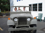
-In the first slide, the first thing that jumps out is the title because it is big and has a very bright green color. The next thing that catches the eye is the frame where the guy and the girl are talking and then in a cascading motion the second frame is noticed and its contents. During the critique today some of the problems were pointed out. As last time the photos and the people inside them are still blending together, and this is noticeable when one's eyes are squinted. This happens because both the background color and the color used for the people are closely related in their saturation and value. The first time this was pointed out I made the background layer darker and the layer with people lighter, and seemed to do the trick for me, but apparently it was still not good enough. To address this issue again a new tactic will be employed. The new tactic is changing the colors.
-The next slide has a lot a speech bubbles and this impedes the viewer from seeing the image. To correct this problem I will reduce the number of words and the number if of speech bubbles and let the image do the silent talking.
Concept: (What are you trying to say?)
-Using this program, the comic life, I am trying to say that life is full of surprises some more pleasurable than other. Another thing that I am trying to say is that some relationships are not meant to be and should be ended as soon as possible before either partner gets to involved and get hurt really bad when things end abruptly.
No comments:
Post a Comment