Monday, April 27, 2009

Week 15


Assignment:
-The assignment for this week was finish the rest of the website which included finishing up the page for Abraham Lincoln Mesh-up, Second Art Mesh-up, and Comic. See the previous post for the link.

Craft: (How did you do it?)
-Before begging anything I prepared a plan of attack. For the Abraham Lincoln web page I decided that I will use the "Photo" template that was provided; for the Second Art Mesh-up and for the comic web page I decided to use the "album" template. Having this plan I began by moving all the photos that I was going to use to the desktop. After opening up the iweb software I selected the option to create a new page. I selected the "photo" template and began editing the page to make it look like the rest of my pages. To accomplish this I clicked on and opened the inspector. After adjusting the background colors to be the same as previous pages I was now ready to add the photos. I opened the the folder that contains the photos of interest and selected all of them. Then I dragged the photos to the appropriate location and dropped them in. After dropping the photos in, the photos were in disarray so I had to rearrange them to the proper order. After having the photos sorted out, I began working on the rest of the page. I copied and pasted the same text box for the title of the page and copied and pasted the object in which I will put the text in. This ensures that the pages look alike, thus reducing any confusion that might occur. This completes the main objects that will be on this web page. Now I was ready to move on to the next page. Once again I used the option to create a new page. When the window with the templates appeared I picked the album template for the Second Art Mesh-up. To reduce an confusion I made sure to change the background color of the page and use the same text boxes for the text. To add the photos into the album there were a couple of steps that I needed to go through. First I had to open the iphoto program. After having the program opened I pressed the plus button near the bottom of the page to create a new folder. In to this folder I dragged and dropped the photos. Now I went back to the iweb program; I made sure that I can see both of the programs opened. Then I clicked on the folder with my photos for this page and dragged it to the iweb and dropped it into the album. After dropping the photos in, I opened the album and rearranged the photos to make sure that they are in the right order. I created three albums; the reason for this was to make it easier for the viewer to follow the progress of the project. Now I was ready to move on to the last page of the website. I approached this page with the same attitude, which means that that after I picked the album template I made sure to keep things as consistent as possible. To keep things consistent I used the same fonts, same text boxes, and anything else. I separated the project into about six stages which means that I will have six albums. The same approach was used create the albums as for the previous page. After posting the website on the web, I had to go through the website and check everything to make sure that everything was working properly. There were a couple of glitches; some links did not work and some albums did not open as well as some minor stuff such as background color. The next day of class which is Wednesday I corrected the things that I overlooked before. After saving the corrections I was ready to publish it again. The publishing required creating a new folder on the desktop. Then I selected the option to publish to folder. After completing this task, I was ready to publish it to the server. I went online and typed in the appropriate address, and after logging-in I selected the www folder. I clicked the publish icon, and after accepting the terms of java I was ready to transfer the files. I opened the folder that contained my website folders; selected all the files and dragged and dropped them into the box. Then I pressed begin the upload. The upload took a couple of minutes. After the upload was complete I clicked and opened the HTML icon which took me to me site. When on my site I checked everything to make sure that everything is functioning.

Composition: (Arrangement and order of elements)
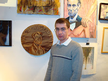
-On the Abraham Lincoln page the first thing that the viewer sees is the photo and then the title of the page. The next thing that comes into the view is the paragraph that describes the project and what is on the page, and finally the rest of the pictures that were used for the project. The pictures are followed by the drafts that were created and the final draft that was created for the gallery. For the Second Art Project page the first thing that the viewer notices is the title of the page which is followed by the picture. The picture is followed by the description of the project and what is located on the page. All of this followed by the albums. On the last page the Comic the first thing that is noticed is the title, which is followed by the paragraph and the albums.

Concept: (What are you trying to say?)
-Using the web site I am trying to say where I am coming from and how it has influenced my work. Another things that I am trying to say is that technology makes communication easier. I am a novice to creating a website, but even with my limited knowledge of creating a website I did not have any serious setbacks. From telephones to websites anyone and everyone can keep in touch with people around the world.

Week 14 - NEW WEBSITE!!!

To view my new website click here

Monday, April 20, 2009

Week 14


(Some pictures that will be used for the website)

Assignment:
-The assignment for this week was to create two web site pages, one about me and one about visual communication, using the iweb software.

Craft: (How did you do it?)
-The first task at hand was opening the software. To do this I clicked on the hard drive and opened the applications folder; I scrolled down and doubled clicked on the iweb icon. Now that I was in the program it was time to make a new site. To do this I went under file and selected "new site." When I did this a screen opened up which had a variety of templates to choose from. I chose "Black" as my template. I chose this template because of its simplicity; not having the page cluttered up will enhance the viewers experience. Before I could continue building the page, I needed something to fill it with. To fill the page, I will use jpeg photographs of old project. The projects that will be posted are: Abraham Lincoln mesh-up, second art mesh-up, and finally the comic. To make life easier I created a main folder and named it Web-VC. Inside this folder I created five folders which includes one about the artist, me, one about the class and one folder for each project. Having accomplished this I proceeded to gather all of the information that would help fill the folders. I found some pictures of me that help establish were my views are coming from. I also collected all of the projects into their appropriate folders which includes a final copy and drafts of that particular project. Having all of the information organized I began building my page. I started by first dragging and dropping the pictures into picture boxes. To give the photos some unique look I added a frame. This option can be found in the inspector. Having typed my essay prior to beginning any work all I had to do was copy and paste the text into the appropriate text box. To make my site unique I added some shapes and played around with the colors for the background. During the critique there was one thing that was pointed out to me. I turns out that I had different styles on two different pages. To fix this problem I am going to keep things as I identical as possible; this means that I will keep the colors the same as well as the font.

Composition: (Arrangement and order of elements)
-On the first page of the website, the first things that jumps out at the viewer is the picture of my family and me in the Jeep. The reason for it being the first thing noticed is its size and location. When one opens the page, the photo takes up most of the page. The photo is placed at the center and there is nothing around it, which is going to direct the viewer to go to the picture. After the main photo the next thing that stands out is my name and the paragraph that describes me. The rest of the stuff on the page is viewed in a linear matter. On the second page the first thing that stand out is the photo then the paragraph, which is followed by the second photograph and its explanation.

Concept: (What are you trying to say?)
-Using the web site I am trying to say where I am coming from and how it has influenced my projects. Using the website I am also trying to say that every experience that one has during his/her life will influence everything that one does which includes anything and everything including ones art work.

Monday, April 13, 2009

Week 13


Assignment:
-The assignment for this week was to use the information received during the critique and apply it to the project.

Craft: (How did you do it?)
-During the critique my classmates pointed out some room for improvement. To fix the problem that was present in the comic I needed a new tactic; this new tactic will consist of changing the whole selection of colors. The new colors that will be used for the comic are yellow, red, and blue. For this part of the project we are no longer limited to just two colors so having three colors is still within the limit of the assignment; however, to remain as true to the two color theme that was set before I will use two color primarily. Having a saved copy of all of the photoshop slides removing the digital color was easy. After removing all the color, I had a black and white picture. To me this was like a new canvas on which I can start a new piece of art. The same procedure was followed for the rest of the slides. Having all the slides desaturated I began planning what will be was color. I decided to stay consistent throughout all the slides so I am going to use the yellow color for the people and anything that I feel is really important. The reason for choosing yellow is because it is very bright and stands out. For the background I will use a baby blue color. For some areas I will use the red color. At this point I had a rough idea of the layout of the colors so I began adding the color to the previously flattened image. To flatten the image all you have to do is go under the layer option and select flatten image. I created a new layer, selected the color I wanted for the background, and added the color using the pain bucket tool. I made sure that the photo layer was set to multiply and that the original photo was on top of the color layer. Then I added a new layer and chose the yellow color. Using the new layer and the yellow color I added it to the people’s skin. I added the red color where I needed another color to make something stand out or make something around it more visible. The new colors were added to all slides with as much consistency as possible. Another thing that was pointed out to me was that the slides did not have the same style. To take of this problem I picked one filter and applied it to all the slides. The filter that I picked was the stamp. Some photos at first did not look good so played around with the adjustments and settled on what I thought provided the best picture. Some worked out better than other so a compromise had to be made in some photos. After completing this task I saved the photoshop document. Next I had to transfer the new photos to the comic life. I just clicked and dragged the photos and dropped them where they belong in the comic. The same layout and frames will be reused and the same goes for the speech bubbles, but some bubbles will be removed and some will be reduced. After dropping the photo into its proper place, I made some adjustment by either making it larger or smaller. After having placed all the slides into their right places and making the necessary adjustments I saved the comic life file. This was the final draft, and now we must move on to a new project. The new project will involve creating an online portfolio. This task will be done using the iweb software.

Composition: (Arrangement and order of elements)
-For comparisons reasons, the same slides will be analyzed as in the previous blog. The first slide with the new colors looks better for several reasons. The people pop-out from the background making them easily visible; even pass the squint test. Whereas the previous version failed this test because the background color and the people were colored in similar value even though the hue was different.
-The second frame in the previous version was hard to see because of all the speech bubbles and the colors were not working too for the same reason as the first slide. Both of these issues were addressed in the new version. The people in the new version pop-out and the reduction in text makes it easier for the audience to see what is going o in the frame and in this particular point of the story.

Concept: (What are you trying to say?)
-Using the comic life program and the story slides I am trying to say that if you can imagine it can be done. There are no limits as to what can be done with the technology that we have today. We can take any photo and modify it to unrecognizable state, thus creating a new piece of art work. We can also take ordinary family photos and make them extraordinary by putting them into programs like the comic life, thus enhancing the memories that the family wants to save.

Monday, April 6, 2009

Week 12


Assignment:
-The assignment for this week was to create a comic using the comic life program. This comic still needs to be able to tell the story.

Craft:(How did you do it?)
-Before opening and beginning working on the comic life program I made sure that I had all the frames for the story done and that the frames had the accompanying dialogue. After having this sorted out, I opened the comic life program. The first thing that I did was set the page to be landscape because that was one of the requirements. Then I browsed through the different arrangement patterns that the program has available. Having browsed through most of the pre-set arrangements I picked the one I liked and thought would work best to deliver the story. Some of the shapes I did not need so I deleted them. To add the photos into the shape I you have to do is click on the photo of interest and drag it into the desired place. After placing the photo into the proper shapes, I edited it; the way I edited the photo was by making the photo bigger or smaller. To do this I double clicked on the appropriate shape which gave me an orange outline and this means that the photo is selected. I also edited the box in which the photo is housed-in to have full control of what the viewer is going to see. After completing the lay out of one page, I began the search for the perfect color for the background. To mix it up a little bit, I used the gradient option and picked a second color; the end result is a transition from a red to gray color for the background. This program was chosen for its user friendliness, and it is true this program is easy to use. This program makes it easy to add text where desired. All I did to add speech bubbles was click on the speech bubble and dragged it to the location where I wanted this speech bubble to be. Then I added the text. This is a critical step because it can help the viewer see the story. The title was placed on the first page, and this was done by using the lettering option. To add some style and uniqueness the letters were colored green with addition of a gradient. The same principles of choosing a layout and then filling and editing the photo were taken for the rest of the pages.

Composition: (Arrangement and order of elements)
-In the first slide, the first thing that jumps out is the title because it is big and has a very bright green color. The next thing that catches the eye is the frame where the guy and the girl are talking and then in a cascading motion the second frame is noticed and its contents. During the critique today some of the problems were pointed out. As last time the photos and the people inside them are still blending together, and this is noticeable when one's eyes are squinted. This happens because both the background color and the color used for the people are closely related in their saturation and value. The first time this was pointed out I made the background layer darker and the layer with people lighter, and seemed to do the trick for me, but apparently it was still not good enough. To address this issue again a new tactic will be employed. The new tactic is changing the colors.
-The next slide has a lot a speech bubbles and this impedes the viewer from seeing the image. To correct this problem I will reduce the number of words and the number if of speech bubbles and let the image do the silent talking.

Concept: (What are you trying to say?)
-Using this program, the comic life, I am trying to say that life is full of surprises some more pleasurable than other. Another thing that I am trying to say is that some relationships are not meant to be and should be ended as soon as possible before either partner gets to involved and get hurt really bad when things end abruptly.

Monday, March 30, 2009

Week 11


Assignment:
-The assignment for this week was to use only two digital colors to enhance the story slides.

Craft: (How did you do it?)
-The first major hurdle that needed to be passed was to make a decision about which colors should be used. Jessica and I settled on using red and purple; however, we are not limited to just these to hues we have the different saturation levels of colors that can be used; also different values can be used of the two colors. The color choice may be limited, but the combination of these two colors is endless. Since our story has twelve slides, we once again decided to work on six slides each. Now it was time to get down to doing some work. After opening the slide of the story that I will be working on, I desaturated the slide of any and every hue; this gives me a clean plate where I can let my imagination and color combination run wild. Knowing my limits in terms of color I began by choosing a dark and saturated color to use for the background. Before I could proceed any further, I flattened the image. Now I was ready to start adding some digital color. Having my background color picked out, I created a new layer so I can add this color. For every new color that I decided to add I created a new layer because this allowed me total control in the sense that if after completing the task and I do not like the way the image looks I can delete the layer without affecting the rest of the image. After playing around with different saturation level and different values of both red and purple I had the slides done. To accomplish the assignment I used a couple of tool to help me accomplish my job; in this process I used the polygon lasso, eraser, and a brush. These tools were the best tool for the job at hand because they made the job easier and more efficient.

Composition: (Arrangement and order of elements)
-In the slide where the two people are talking the first thing that the eye catches are the people or at least this was the plan. During the critique today, an issue came up, and the issue was that the image blended together. What this means is that the people disappeared into the background. The reason why the people dissolved into the background is because the colors that were used for the background and the people are very similar in value and saturation. To solve this problem, I have to make the background color darker and make the people lighter; this will allow for the people to pop-out from the background and will defiantly be the first thing that the eye notices.
-The slide where the girl is dreaming had the same problem. The viewer needs to be focused on the girl and the bubble which represents the dream, but the eye is not drawn there. To make the correction, the background will be made darker and the girl and the bubble will be made brighter. By addressing these things the audience should be drawn to the girl and the bubble which is where the action is happening in this slide.

Concept: (What are you trying to say?)
-Using only two colors was a challenge, but well forth the extra time that went into planning. Using just two colors allowed for an opportunity to work with different values and saturation levels of the same color; this makes the art work more unique. By using different values and saturation levels of either color allowed for development of a specific mood in that particular moment of the story.

Wednesday, March 25, 2009

Week 10


Assignment:
-The assignment was to work on the story slides in our groups using all the knowledge that we have about the photoshop program and its tricks.

Craft:
-For this project each and everyone in class was divided into group; some groups have two people other groups have three. I was paired up with Jessica Greene. The backbone of the story for every group is that there is one person traveling, one person waiting, and one of these people has the package for the other. After some brainstorming and deliberation Jessica and I settled on an idea. The idea for the story is that a husband of a newly wed couple goes to Italy for a medical convention, and while there he falls for another woman. Having this general view of the story Jessica and I collaborated and created a dialogue. It is best to shoot the photographs of people and places separately and later combine them using the photoshop program. Before any pictures were taken we have some to an agreement that I would be in charge of taking pictures of places and things, and Jessica would be in charge of getting pictures of people. Having the dialogue as our guide map we set out and took the necessary pictures. Next time we met we combined our photographs and began working on the project. During the whole process we were both providing inputs to each other. This allowed for mistakes to get fixed before they got out. This is one of many advantages of working with someone else. Having another pair of eyes helps catch mistakes and provides another perspective on the same images, thus allowing the images that was created to undergo a message test. Having someone to collaborate with allows for more time to be spent on each slide because you are not rushing to get the assignment done; this means that each partner will have more time to get the details straight and make sure the image says what it is intended. After having completed all twelve slide we combined the slides, placed them in order, and printed them out. The slides were passed around and each group was allowed to look at and give feedback on the work. This is also a form of collaboration because other people are looking at your work and providing opinions on how to improve the story.

Composition:
-When we were working on our slides we used each other to make sure that the applied filter as well as other things did not ruin to readability of the photograph and that it conveyed the intended message. Also, when slide had more than one layer subsequently more than one object of interest, Jessica and I worked together on the arrangement of these objects. This makes sure that the eyes of the audience will follow the path that our eyes followed. The first thing to get noticed in the first picture is the leaning tower of Pizza, and then the two people in the picture. The second picture has the people in the center because this is where the action is happening in this frame of the story.

Concept:
-Collaborating with someone on an art project, research or writing a book is one of the best things that anyone can do. This is due to the fact that you have another set of eye to inspect your work, and you have another brain which can be picked at for new ideas. Working with another person on a project while using different programs can be helpful; for example, one member of the team may have forgotten how to do something thus the other member would help. Overall, working with someone else on any project is fun that is if they pull they share of the work. Working alone may create unique style, but when two people combine their styles it becomes even more unique, and example of our styles being combined can be noticed in the two pictures above.